
Forecasting Your Traffic Growth Using Z-Chart
I’m sure every web analysts look at site visitors frequently. It is probably the first thing everybody asks and looks for any discussion relating to websites.
I thought I would give a little different perspective on how we typically look at traffic data, using monthly visitors as an example to understand traffic growth using Z-Chart.
Before diving into looking at Z-Chart, let’s quickly go over what Z-Chart is.
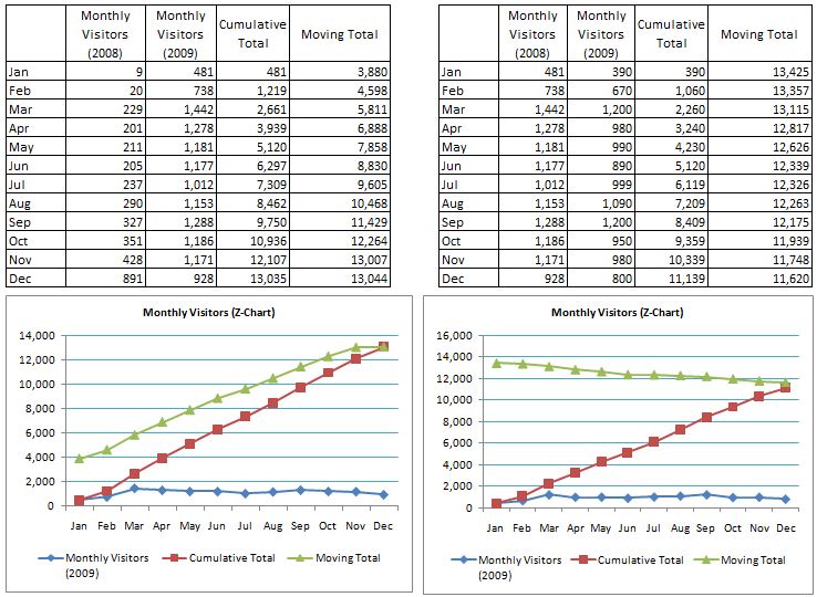
Z-Chart is a method of short/long term forecasting by plotting cumulative and moving total figures for any measured value across time on one chart.
There are three lines represented in the Z-Chart:
(1) Current line: It shows the variation for each period
(2) Moving total: Smooths out any seasonal variations
(3) Cumulative line: Joins these and may show progress towards a goal
The name Z-Chart arises from the fact that the pattern on such a graph forms a rough letter Z. A typical application of Z-Chart is on sales figure, but let’s see this from the website traffic perspective.
Here is a rough example monthly visitors data from a website with positive growth, and another one with not so exciting traffic growth.
Evidently, Z-Chart will tell you if your trend is sucking or not. Sharp positively increased Z (left image) shows some significant growth trend, while sagging Z (right image) shows the site traffic is not doing well as the other.
Note that the Z-Chart could be dissected to remove some of the distraction like the cumulative total that gives an impression that the site traffic is growing. (Obviously, 2009 data on the right chart is much lower than 2008).
The idea of having these two Z-Charts side by side is to show how it would look when two different data are trending differently and to apply general web analytics approach comparing one segmented data to another. (e.g. overall traffic vs. product page view).
Here is an idea for web analysts. If you can apply overall traffic and compare it against segmented traffic, you may find something interesting.
For example, overall monthly site visitors that came from paid advertising and hit the product page for one Z-Chart, and monthly site visitors from Organic sources to product pages on another Z-Chart.
What does the difference look like? If it looks like the example on this post, then there might be something broken with accessibility or acquisition strategy on product visibility.
That raises a question like “why is my product pages traffic are not seeing the same Z shape as overall site traffic?”. Then you need to further dissect the chart and data.
There are many charts related postings out there and it is definitely worth reviewing them.
You could be dissecting these type of charts in so many ways, and find that detailed insights are not immediately available from this one single chart. Going to leave that expertise to the chart gurus.
What does your Z-Chart show you?
Some links on Z-Chart related topics:
http://home.ubalt.edu/ntsbarsh/Business-stat/stat-data/Forecast.htm#rzchartforcat
http://syque.com/quality_tools/toolbook/Line/vary.htm
Very nice tutorial on excel and charting techniques.
http://www.peltiertech.com

ZoomMetrix Newsletter
Join the newsletter to receive the latest updates in your inbox.